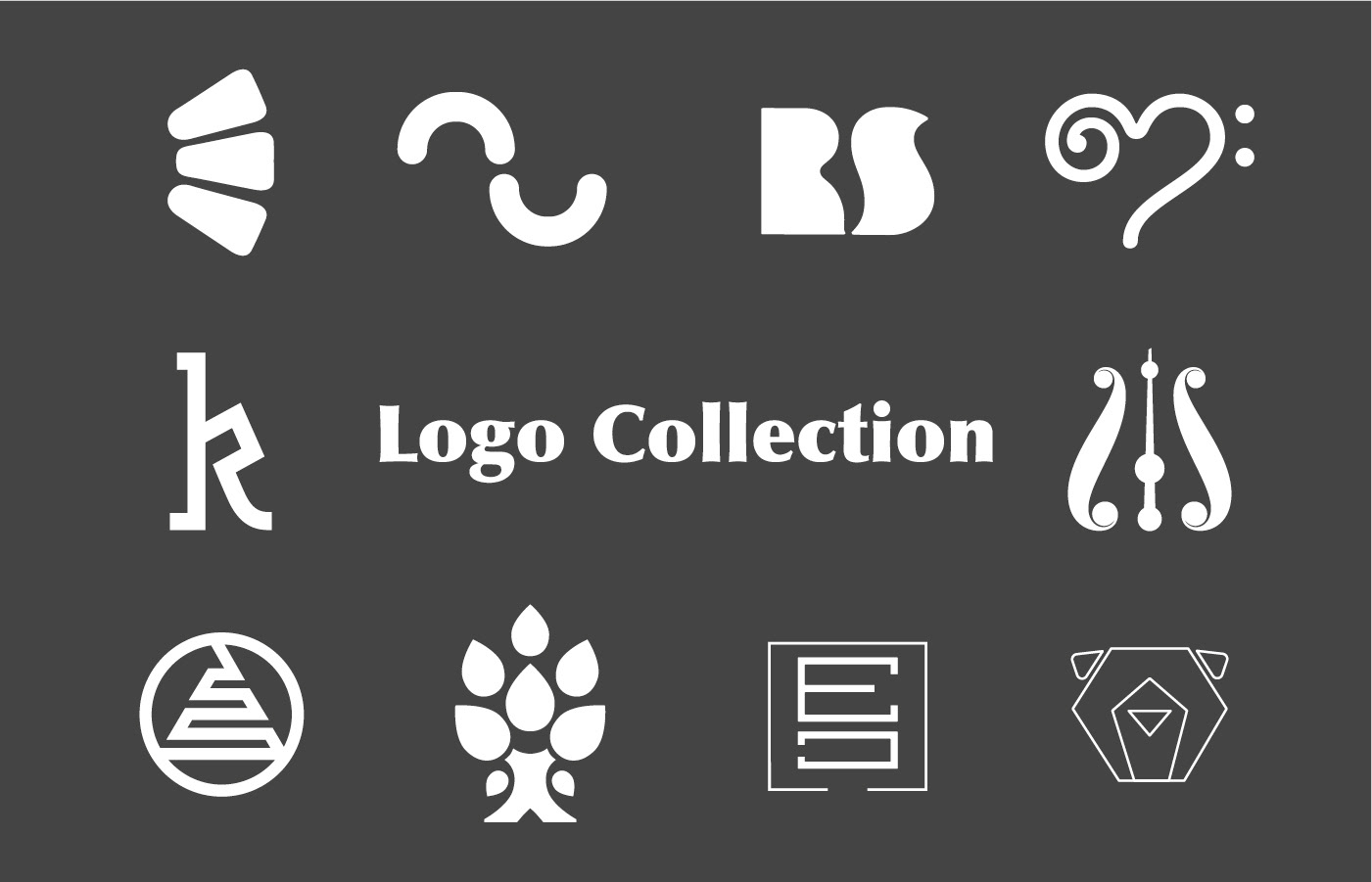
A strong logo is more than just a mark—it’s the foundation of a brand’s visual language. This collection features a series of logos I’ve designed for diverse clients and projects, each with its own story, concept, and approach. From cultural institutions to online stores, every logo is crafted to communicate core values and create a lasting impression. Here, I share the thinking behind each design and the solutions tailored for every brief.
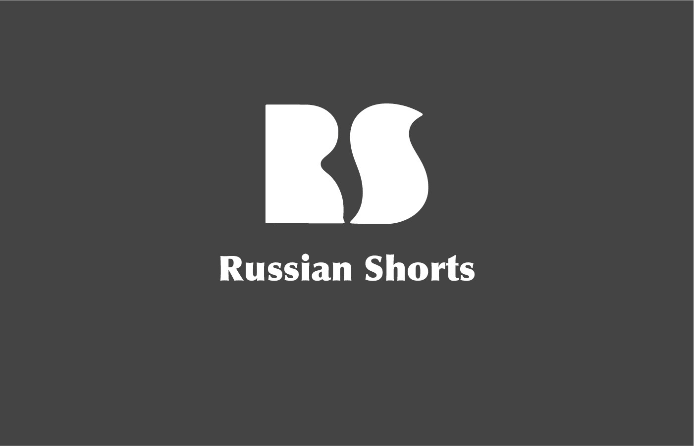
A custom monogram created for a book series, where the initials subtly incorporate a ballet shoe in the negative space—evoking a sense of Russian cultural identity and literary elegance through clever visual interplay.
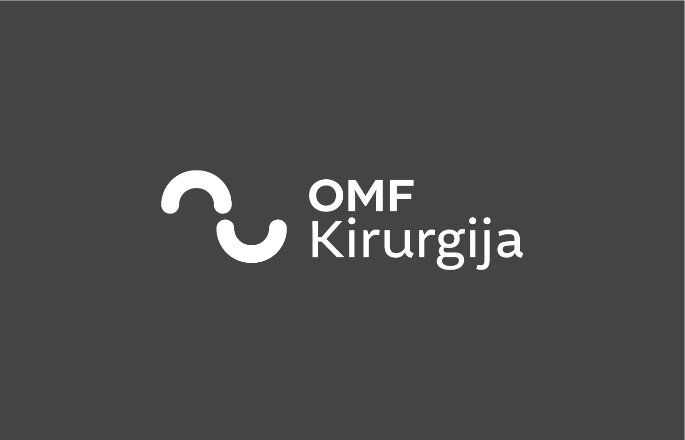
A minimalist logo composed of two half circles—the upper arc forms the shape of a tooth, while the lower arc creates a subtle smile—coming together in a simple, inviting symbol of dental health and positivity.
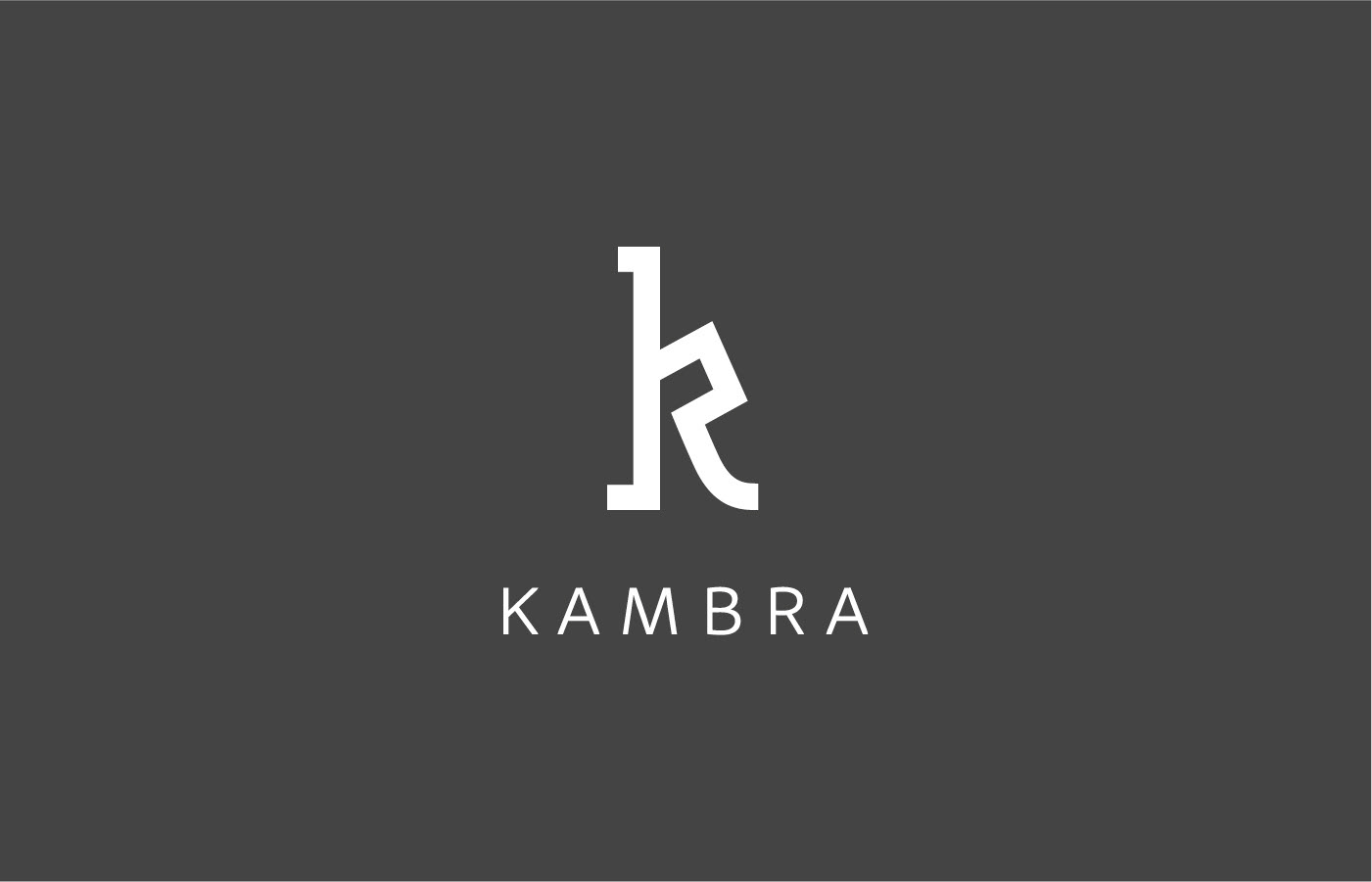
A logo for Kambra guest house that draws inspiration from the building’s distinctive architectural shapes—blending structural forms with welcoming elements to create a visual identity that reflects both character and hospitality.
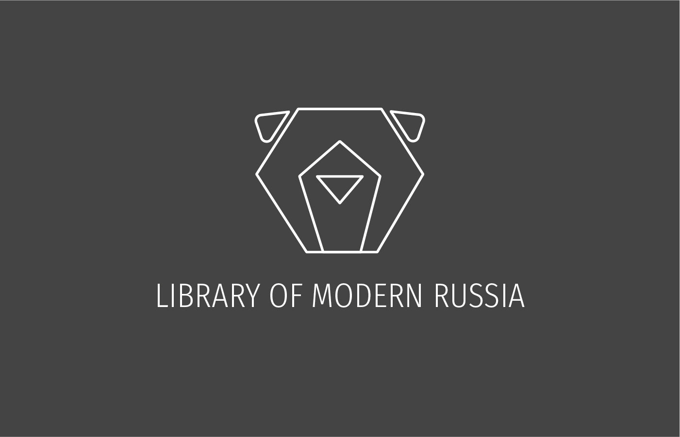
A refined, geometric bear mark created for a book series—balancing strength and approachability to deliver a distinctive, cohesive visual identity across all volumes.
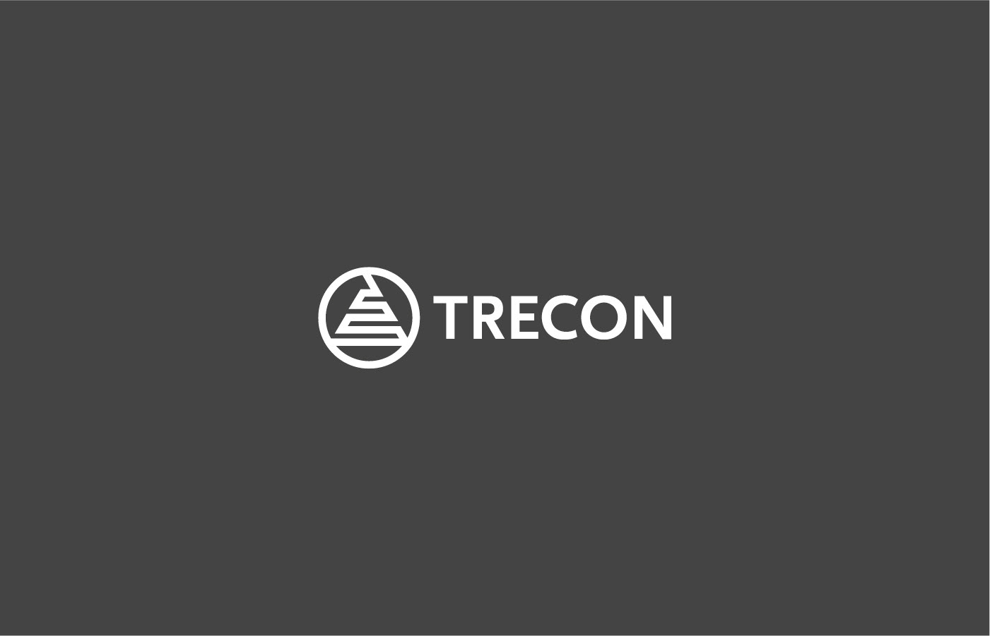
An updated logo for an automation company, featuring geometric elements and clean lines to convey precision and technological innovation—modernizing the brand while building on its previous visual identity.
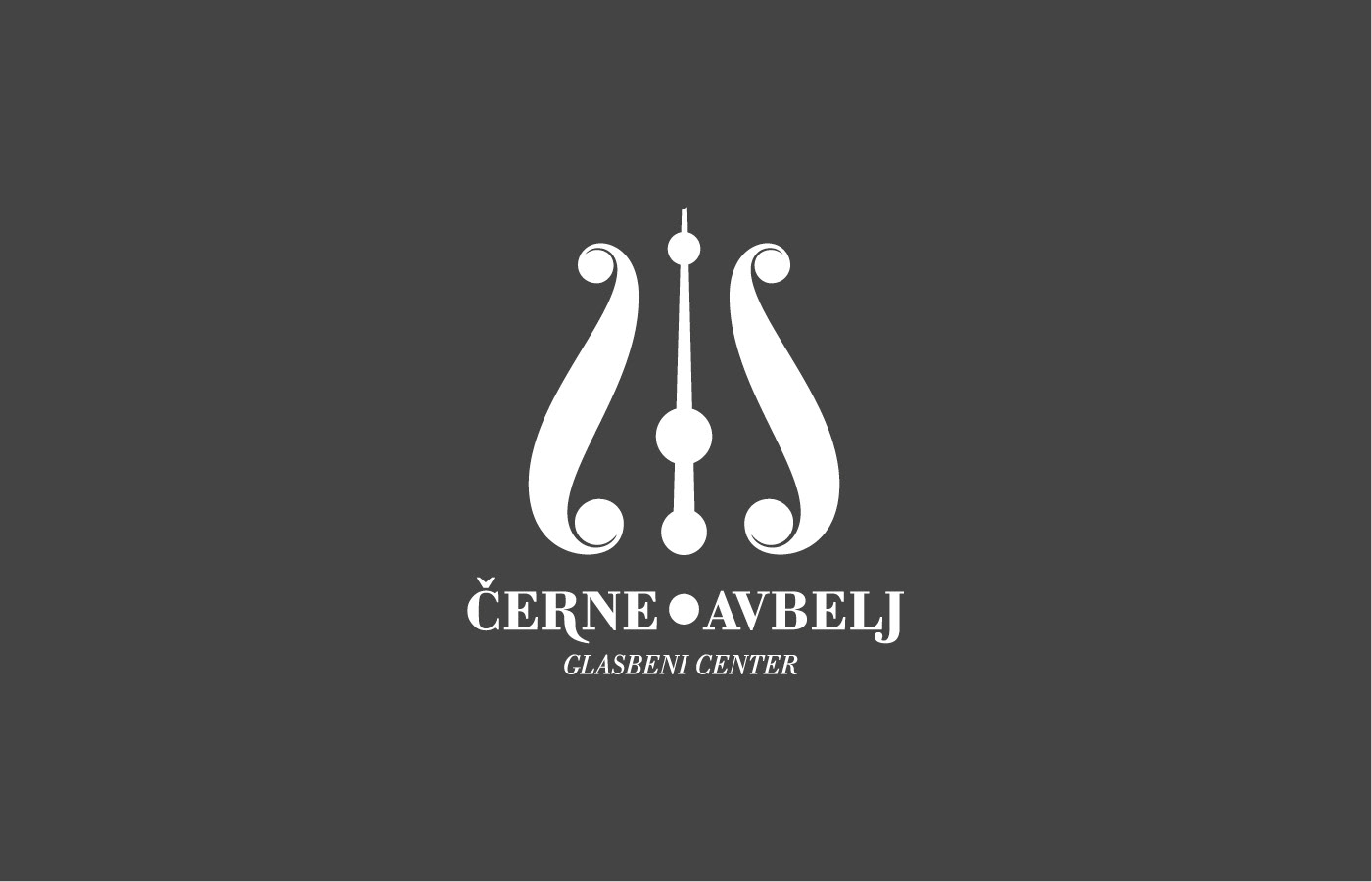
A modern logo for a musical center, featuring stylized shapes that form a metronome—symbolizing rhythm, precision, and the foundational role of timing in music education and performance.
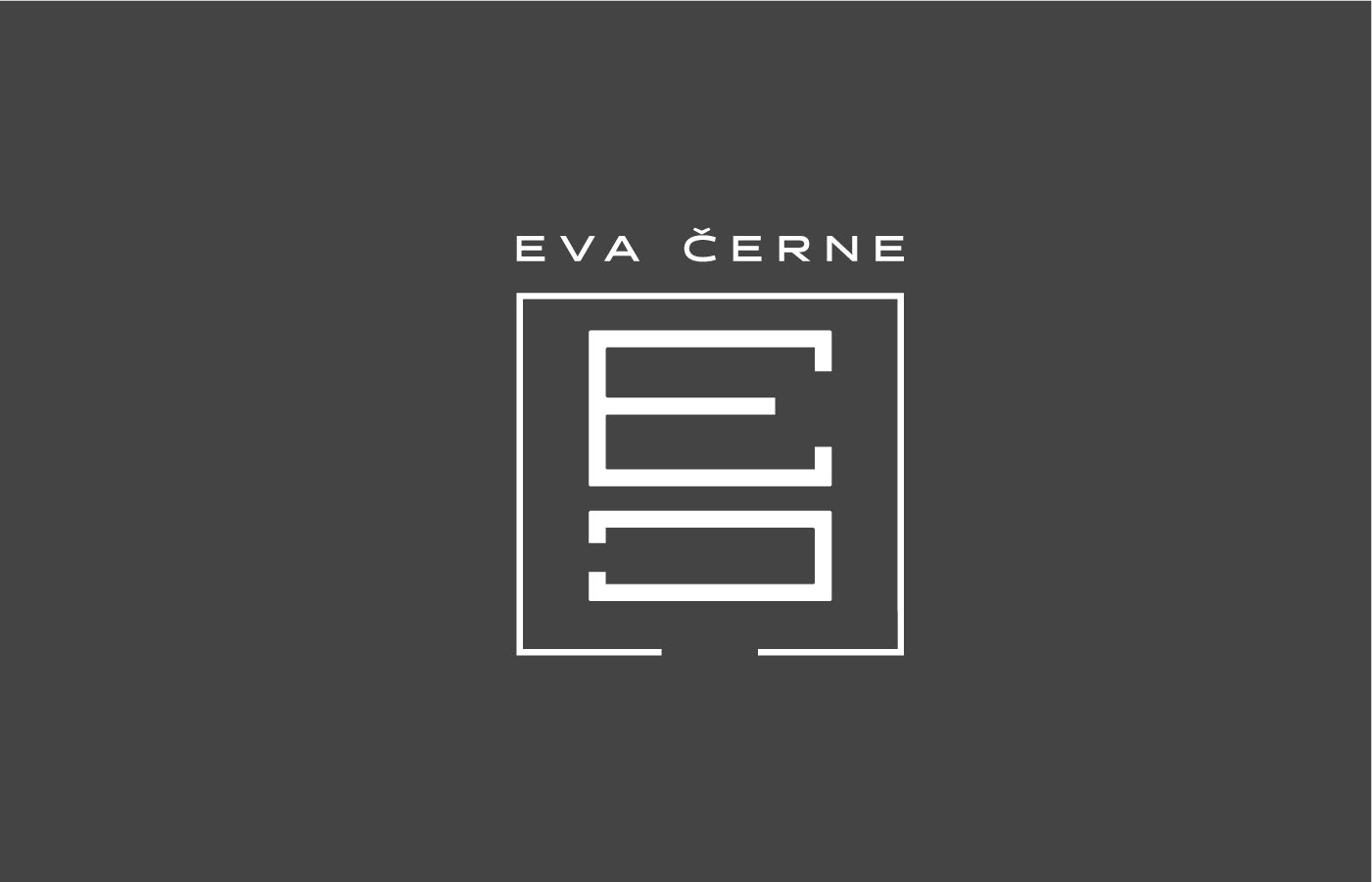
A modern logo for a singer. Composing of 5 horizontal lines lika a staff and forming amonogram from the first letter in the name and in the surname.

A minimalist logo for a manual physiotherapy practice, featuring abstract forms that represent a vertebral spine—communicating alignment, care, and the core focus on spinal health.
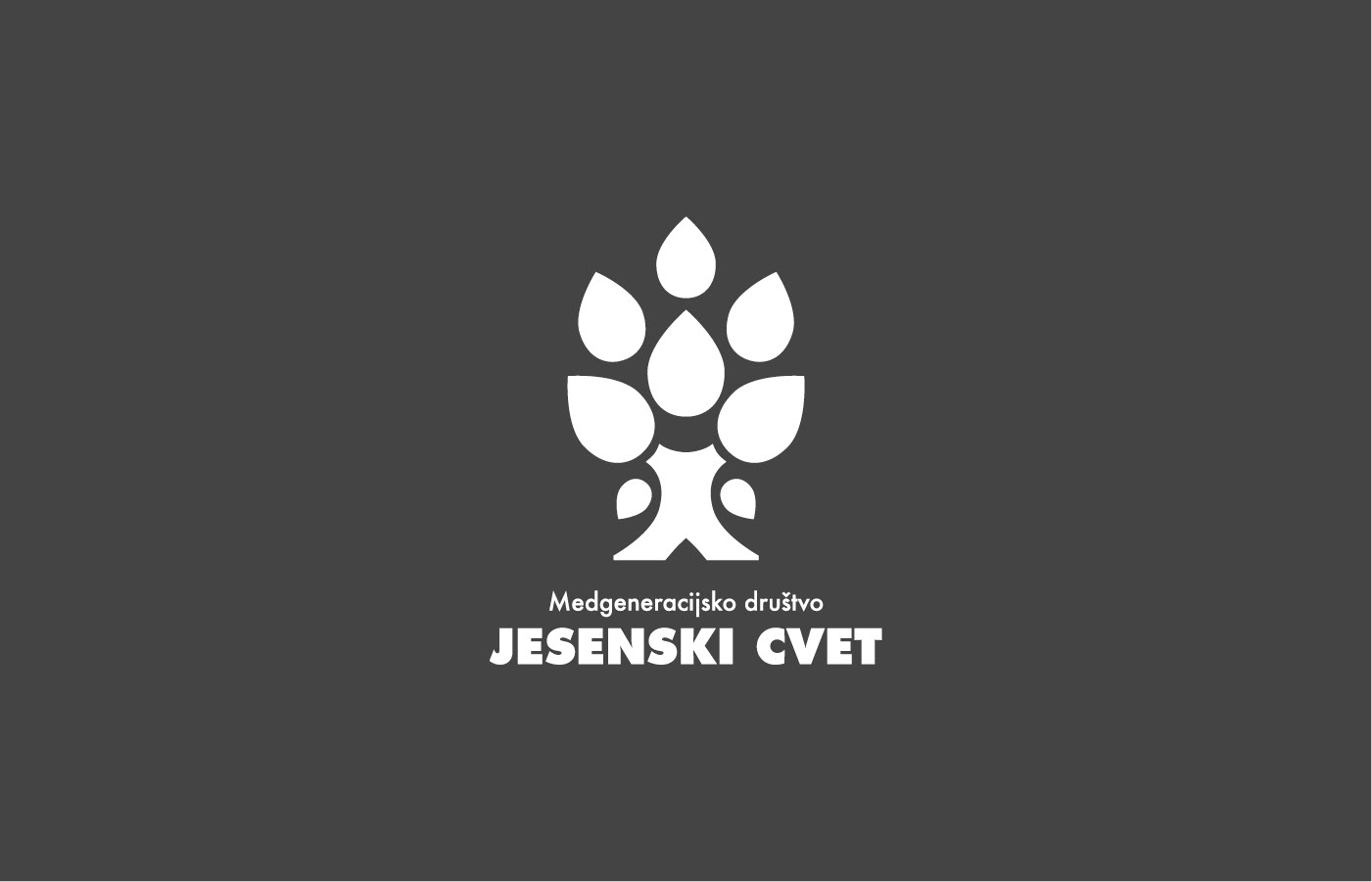
A modern logo featuring a stylized tree, designed to represent connections and growth across multiple generations—emphasizing unity and continuity in a clear, memorable symbol.
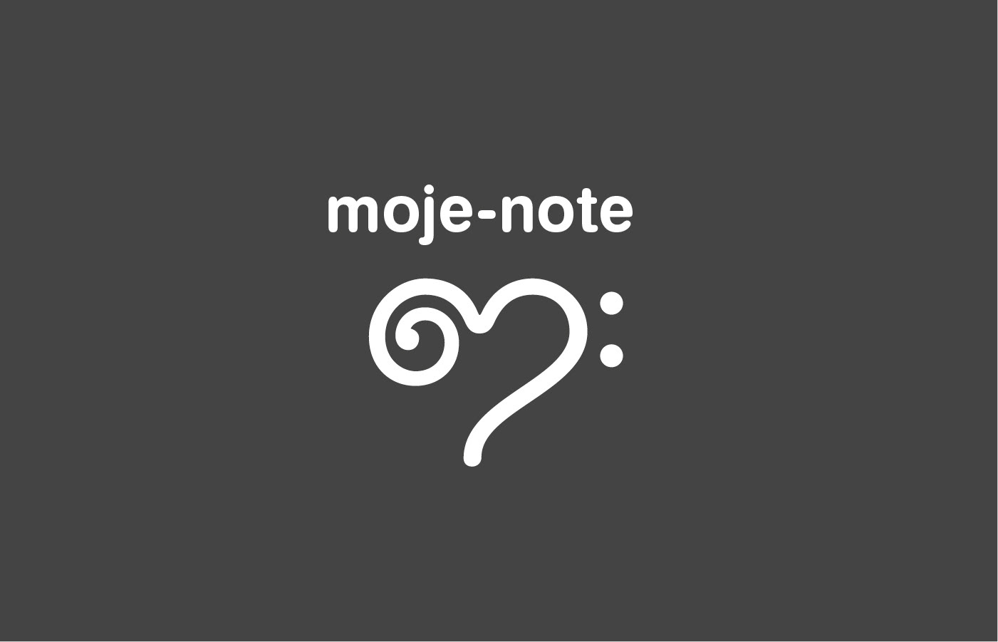
A contemporary logo for an online music sheet store, featuring an abstract mark that cleverly merges the shapes of a bass clef and a treble clef—visually representing the full range of music.