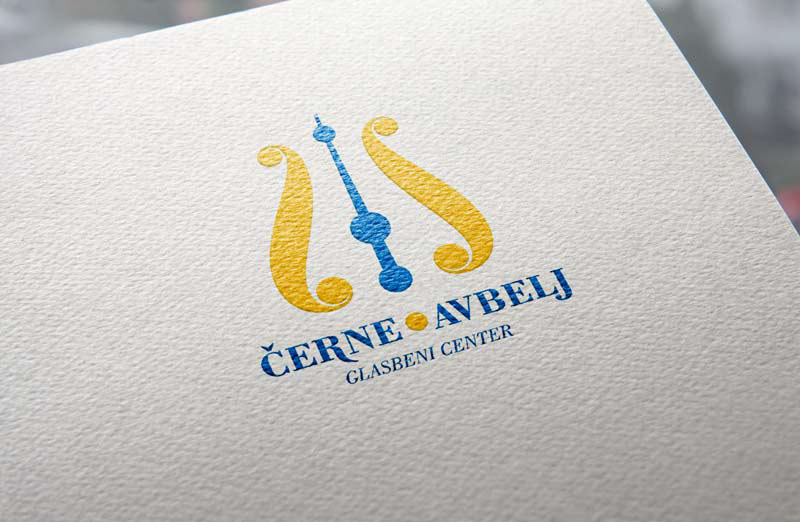
Logo was constructed from two mirrored curves. They resemble the characteristics of a pointed nib pen. In between the curves we have an arrow pointing upwards. The whole construction resembles the shape of a metronome, with it's characteristics: perfection, strictness and quality.